Many Shopify merchants focus on product pages and homepages, but overlook the structure of their collection pages. When users land on a category like “Bath” or “Lighting” and see a long list of mixed products, they often feel lost. Without clear subcategory navigation, shoppers are more likely to leave or miss what they’re looking for.
✅ Key Takeaways:
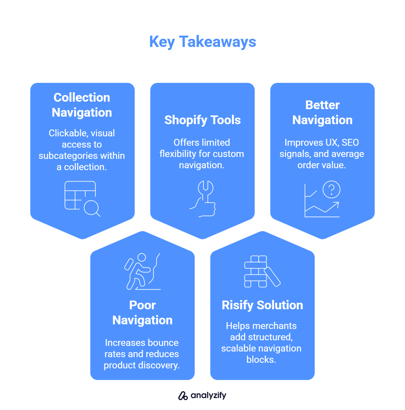
Collection navigation means clickable, visual access to subcategories within a collection (e.g., “Running Shoes” under “Shoes”)
Poor navigation increases bounce rates and reduces product discovery
Shopify’s native tools offer limited flexibility for custom navigation
Risify helps merchants add structured, scalable navigation blocks
Better navigation improves UX, SEO signals, and average order value
What Is Collection Page Navigation on Shopify?
When we talk about navigation on a Shopify collection page, we’re not referring to the site’s main menu. We’re talking about what happens inside a category page once a user clicks into it.
Let’s say someone clicks on the “Bath” collection in your store. Do they instantly see subcategories like:
Freestanding Bathtubs
Corner Bathtubs
Whirlpool Bathtubs
Or are they met with a long list of random products that may or may not match what they want?
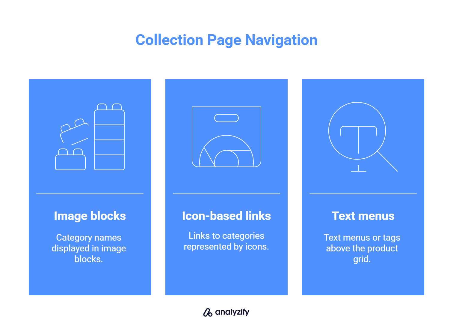
Collection page navigation refers to the structured, often visual, way of helping users explore specific groups of products within a broader category. These can take the form of:
Image blocks with category names
Icon-based links
Text menus or tags above the product grid
When done well, this helps users quickly narrow down what they want, and reduces friction across the buying journey.
Bonus: Learn more about Problems with Shopify’s Breadcrumb Structure
Why Shopify Users Leave When Collection Pages Aren’t Structured
Shopify’s standard collection layout shows products in a grid. If there are 100+ items and no subcategories, users often scroll aimlessly, get overwhelmed, or leave the page.
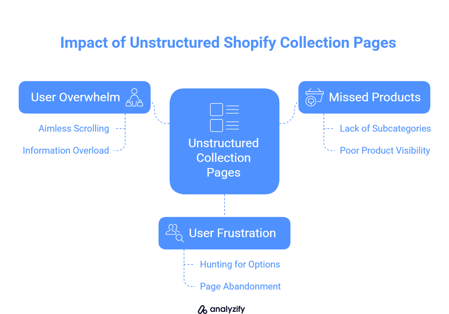
Here’s what happens when collection pages are unstructured:
Visitors see too many product types mixed together
They don’t understand the range or depth of what’s offered
They miss products that might actually be a better fit
They leave because they don’t want to “hunt” for options
On the other hand, stores that display subcategories like “Shower Accessories” or “Wall-Mounted Toilets” help users immediately spot what they need.
Adding navigation elements inside collection pages doesn’t just improve experience, it removes uncertainty. Users feel guided instead of guessing. That’s the difference between a passive product list and an actively helpful shopping page.
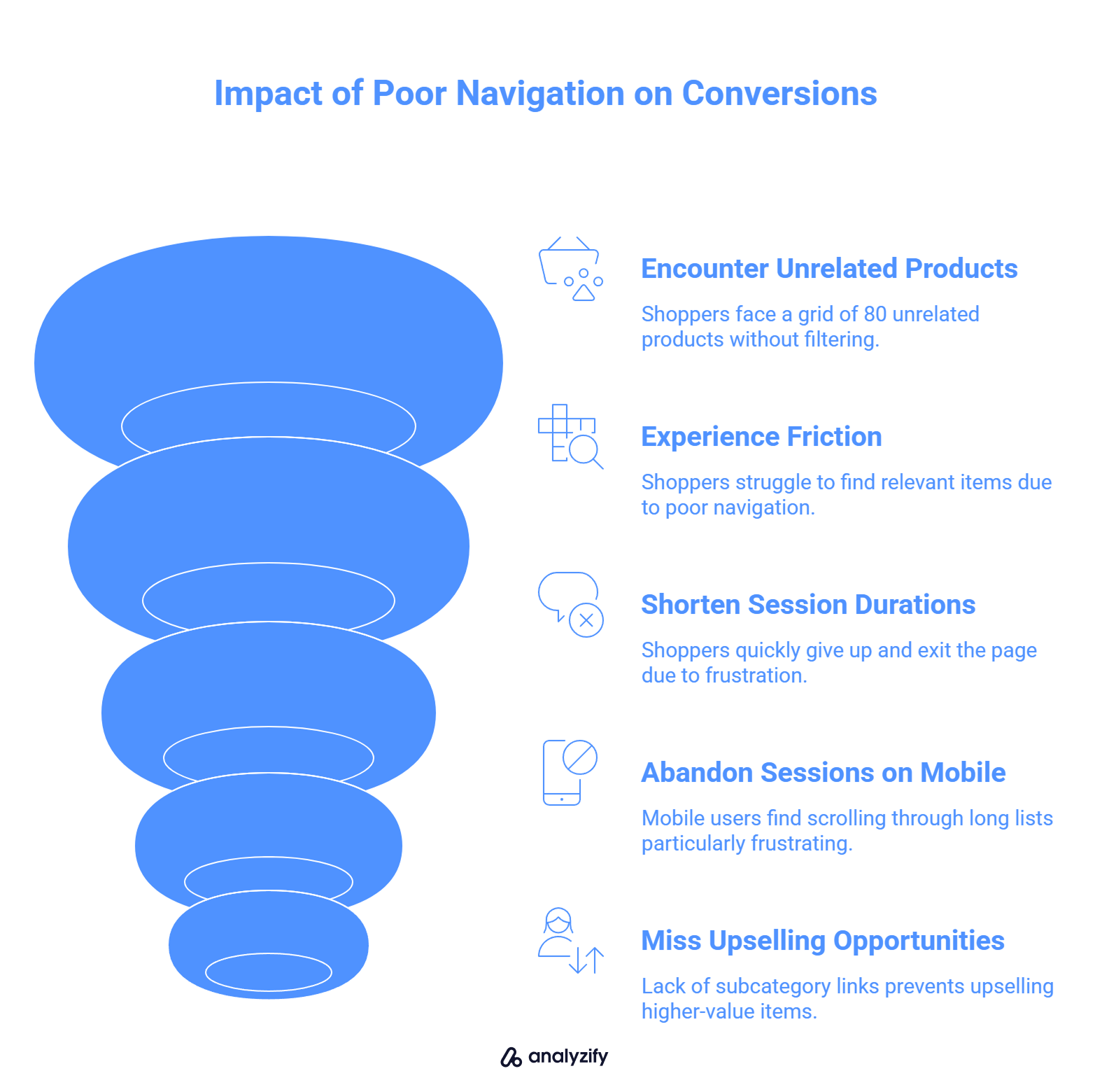
How Poor Navigation on Shopify Collections Affects Conversions
When shoppers land on a collection page like “Backpacks,” they expect some form of guidance. If they’re shown a grid of 80 unrelated products with no filtering or subcategories, it creates friction. They have to put in more effort to find what they want, and many won’t bother.
Here’s how weak or missing navigation impacts conversions:
Lower product discovery: Customers may never reach the items that are actually a better fit for their needs.
Shorter session durations: Without visual structure, users quickly scroll, give up, and exit the page.
Abandoned sessions on mobile: Scrolling through long product lists is especially frustrating on smaller screens.
Missed opportunities for upselling: Without subcategory links or visual prompts, users aren’t nudged toward higher-value or complementary items.
Even if your products are great, poor navigation prevents users from reaching them. For example, someone looking for “Laptop Backpacks” might exit early if everything is mixed in with travel bags, gym bags, and kids’ backpacks.
By adding category-level structure to your collection pages, you reduce the effort required to browse, and that alone can lift both engagement and conversion rates.
 Built to Scale - Works on Large Stores and Shopify Markets
 Managing Too Many Collections Manually?
Risify lets you manage navigation across multiple collections from one place - fast setup, no developer needed.Good Shopify Collection Navigation in Action
Effective collection navigation guides users toward purchase decisions. When implemented correctly, it changes the way users browse, helping them explore more without feeling overwhelmed.
Here are some formats Shopify merchants use to structure their collection pages:
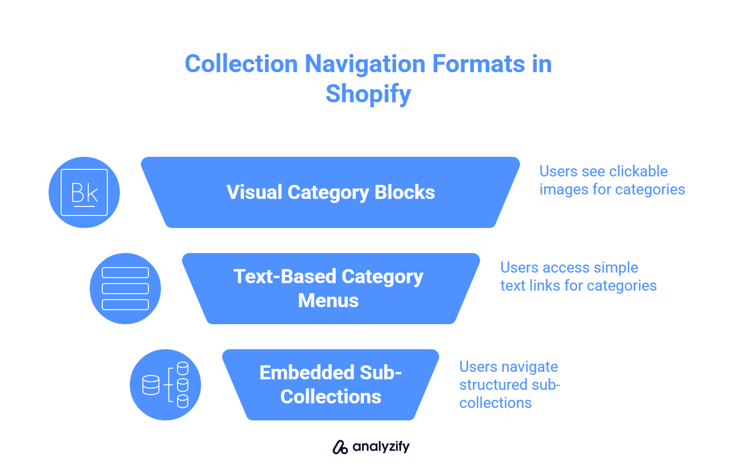
Visual category blocks at the top
Stores that sell electronics often add clickable image blocks like:
“Noise-Canceling Headphones”
“Wireless Chargers”
“Portable Projectors”
These blocks appear before the product grid, giving users a clear choice of where to go next.
Text-based category menus above the grid
In fashion stores, you’ll often see a simple row of links like:
- Men’s T-Shirts | Polo Shirts | Oversized Fits
This layout removes friction. Users don’t need to scroll or filter, they can immediately jump into a specific group.
Embedded sub-collections within the page
Some larger catalogs, like those selling outdoor gear, use structured sub-collections inside the main one:
- Clicking on “Camping Gear” leads to a page that opens with quick links to “Tents,” “Sleeping Bags,” and “Cookware”, all within the same view.
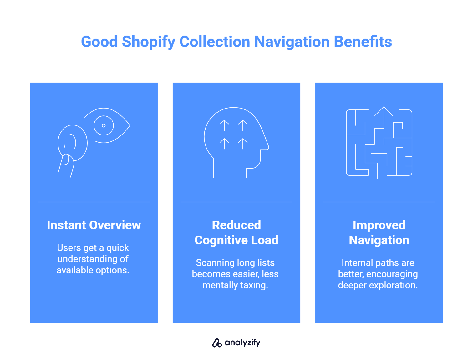
What all of these examples have in common:
They give users an instant overview of what’s available
They reduce the cognitive load of scanning long product lists
They improve internal navigation paths, leading to deeper browsing
When Shopify merchants design their collection pages this way, they create a shopping experience that feels organized and easy, and that directly supports conversion.
How to Add Subcategory Navigation to Your Shopify Collection Pages
If you’re trying to improve the structure of your collection pages, Shopify doesn’t make it easy by default. There’s no built-in way to add visual subcategory blocks or clickable category menus inside a collection page. But there are still several paths you can take:
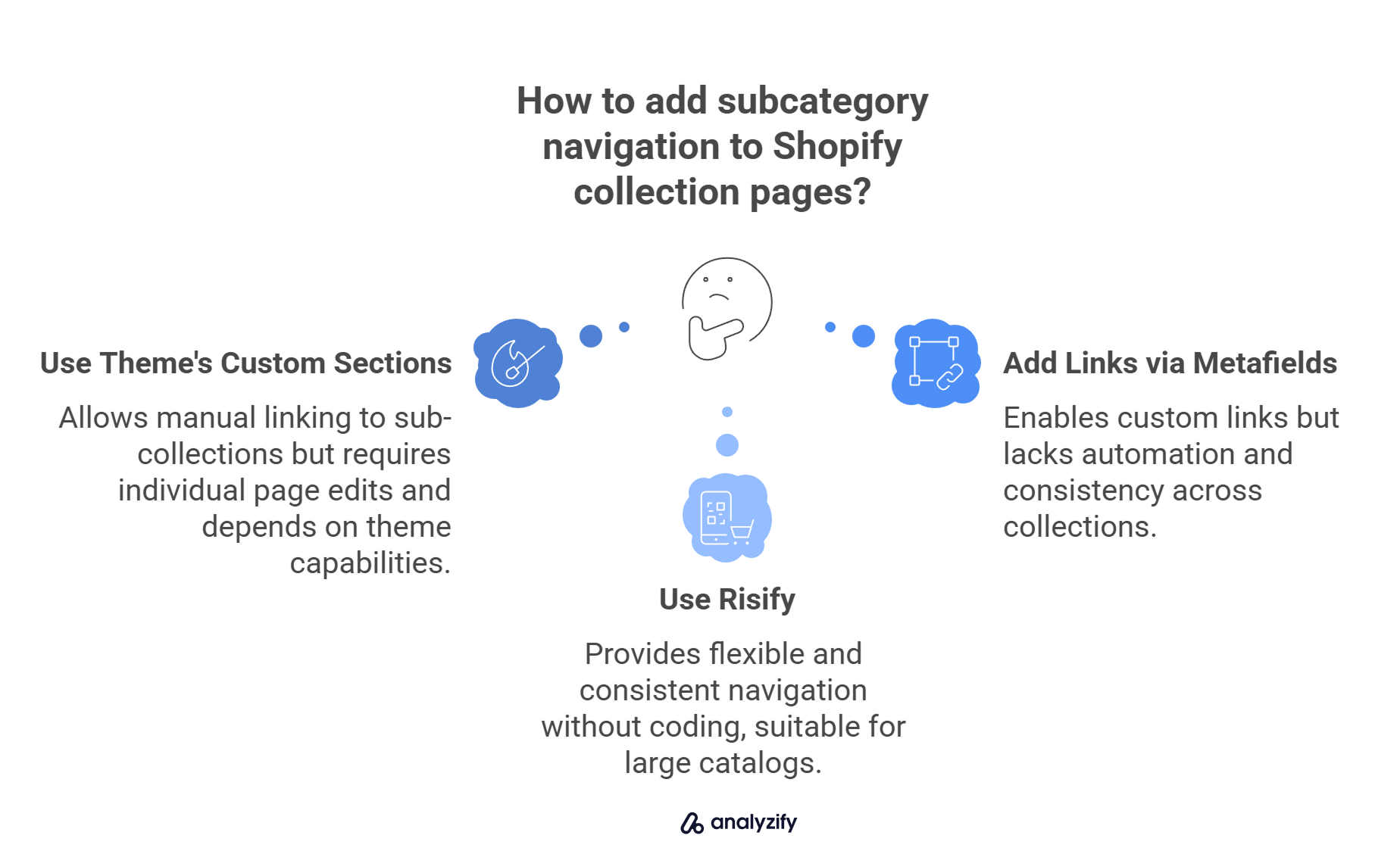
1. Use your theme’s custom sections
Some themes let you add banners, text blocks, or image links at the top of a collection. You can manually link to specific sub-collections like “Running Shoes” or “Formal Shoes.”
Things to watch out for:
Each page has to be edited individually
Your options depend on what your theme allows
It becomes harder to manage as your store grows
2. Add links or banners using metafields or content blocks
If you’re comfortable using Shopify’s metafields or content sections, you can insert text or image links that guide users to more specific categories.
Downsides:
There’s no automation, you’ll need to repeat this process across each collection
It’s hard to maintain consistency across the site
3. Use a Shopify app that adds scalable navigation
If you’re looking for a more flexible solution, an app like Risify lets you create subcategory blocks visually. You can choose which collections should display navigation, customize the labels and icons, and apply it across multiple pages.
With Risify:
You don’t need to edit code
You can maintain a consistent structure across the store
It works even if you have a large product catalog or use Shopify Markets
If you’re aiming to turn your collection pages into better browsing experiences, adding subcategory navigation is one of the most effective improvements you can make, especially if you want visitors to explore more than just the first 12 products they see.
How Risify Helps You Build Better Shopify Collection Navigation
If you want to structure your collection pages without touching code or hiring a developer, Risify gives you full control over how users navigate inside your collections.
Here’s how it works:
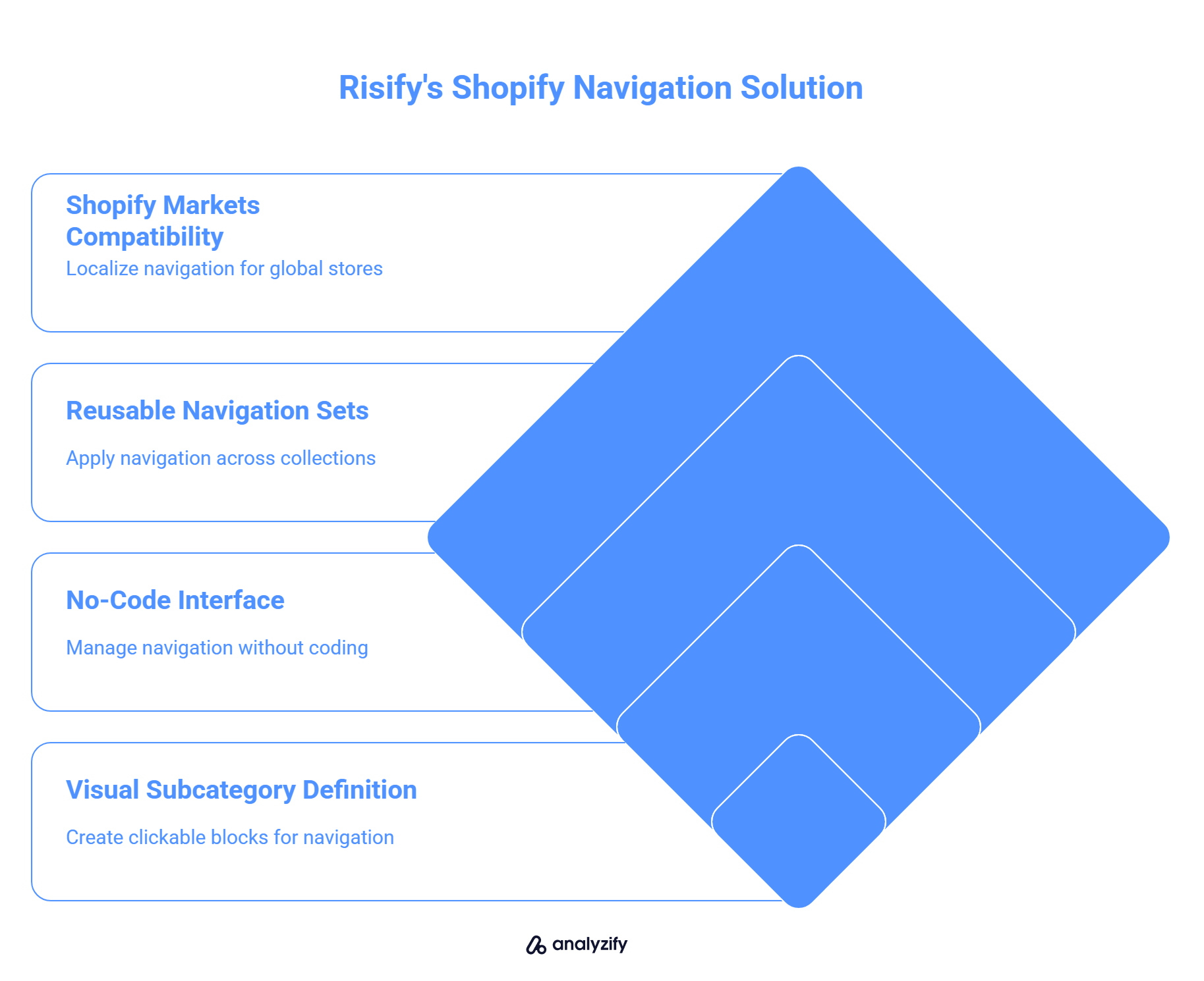
You define subcategories visually. For example, on your “Shoes” collection page, you can add clickable blocks for “Running,” “Formal,” and “Kids.” You choose the labels, images, and destination URLs.
No coding or theme editing required. Everything is managed through Risify’s app interface. You don’t need to modify templates or worry about compatibility with your theme.
Apply across multiple collections. You can create reusable navigation sets and assign them to several collection pages, saving time and keeping things consistent.
Compatible with Shopify Markets. If you run multilingual or multi-country stores, Risify lets you localize navigation elements based on language or region.
When navigation is this easy to manage, it becomes a real part of your growth strategy, not just a one-time fix.
SEO Benefits of Structured Navigation on Shopify
Structured collection navigation improves your store’s internal linking, page relevance, and crawl efficiency. These are all core elements of on-page SEO, yet many Shopify stores miss them by relying on unstructured product grids.
Here’s how navigation impacts SEO in specific, measurable ways:
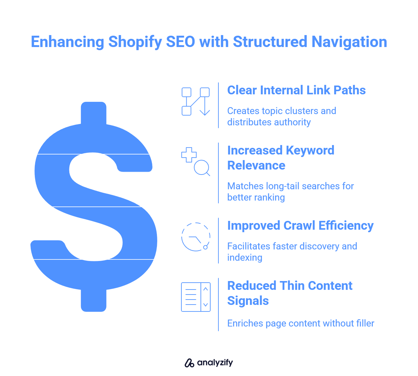
✅ Builds clear internal link paths
When you link from a main collection to subcategories (e.g., “Formal Shoes” from “Shoes”), you create topic clusters. This tells search engines which pages are related and which ones are more specific. These internal links also distribute authority more effectively across your site.
✅ Increases keyword relevance and ranking potential
Subcategories often match long-tail searches more closely. For example, “Adjustable Standing Desks” ranks better as its own page than as a product buried in a general “Desks” collection. Navigation helps expose those subpages to search engines.
✅ Improves crawl efficiency
Search engine bots follow internal links. If your collection pages link to relevant subcategories near the top of the page, these links are discovered and indexed faster. This is especially important if you have a large catalog or frequently add new items.
✅ Reduces thin content signals
A generic product grid with no context looks weak to both users and search engines. When you add subcategory links and structured labels, the page becomes richer in content and meaning — without requiring additional text blocks or filler content.
Improve Your Shopify SEO - Clean Structure, Better Rankings Struggling to Get Collection Pages Ranked?
Risify improves your internal linking and site structure by adding smart navigation elements to your Shopify store.Start With Your Key Collections & Let Risify Help You Scale
Improving navigation on your collection pages doesn’t require a full redesign. Start with your top traffic pages. Identify where users are dropping off, and add clear, clickable subcategory paths that help them find what they’re looking for faster.
If you’re managing multiple collections or want more control without editing code, Risify can help. With Risify, you can:
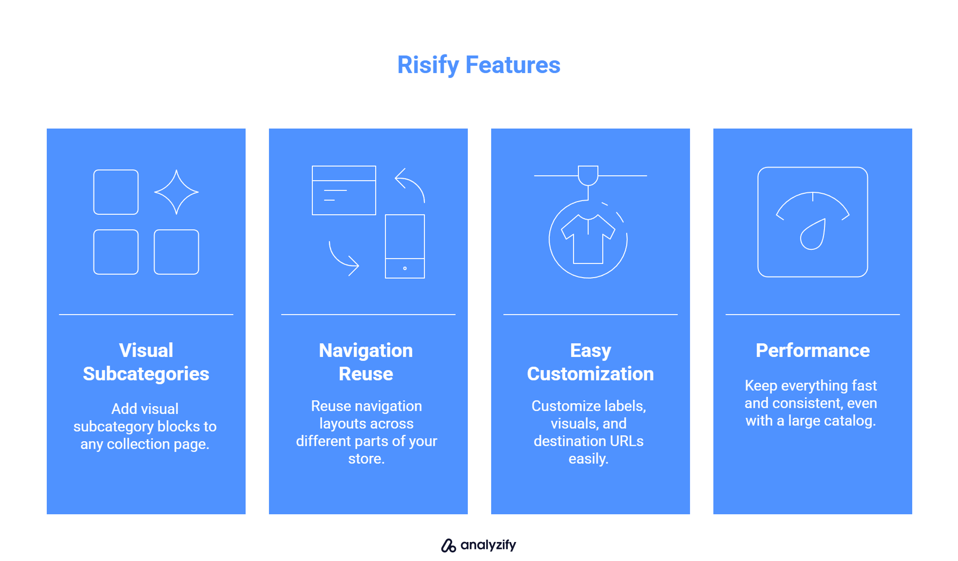
Add visual subcategory blocks to any collection page
Reuse navigation layouts across different parts of your store
Customize labels, visuals, and destination URLs easily
Keep everything fast and consistent, even with a large catalog
Better navigation leads to better user experience, more product views, and higher conversion rates — and with Risify, you can make that change storewide in just a few steps.
Built for Shopify - No Code Needed - Easy to Manage Missing Navigation on Your Collection Pages?
Risify helps you add visual subcategory links that guide users and improve conversions without editing your theme.